


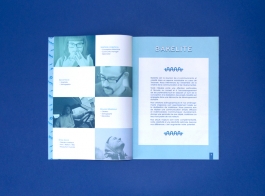
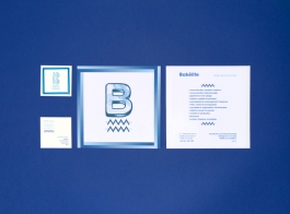
Fictional project about Bakélite, a group formed by 4 creative in a flexible space in the heart of Toulouse.
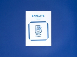
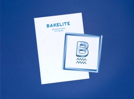
The various delineation of the letter B, gradients and filet, constitute a library of shapes and colors available for Bakélite to compose a logo scalable as required.
Manual look of the gradient gives an organic look that highlights the creative and innovative side of Bakelite, and their interest for handmade.
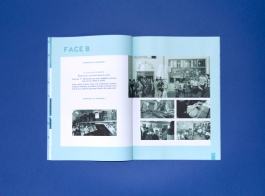
A common identity for a motley studio is thus generated. It evolves with the place, the team, and events.
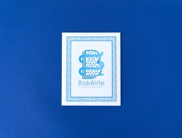

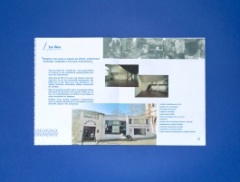
2nd proposition for the Bakélite fictional project.
The logo graphically represents the four major practice of Bakélite, graphic design, object design, set design and interactive design. It highlights the overall appearance of the design proposed by Bakelite and the resulting quality.
The visual show different viewpoints, mediums and stylized approaches, so as not to be limited to a simple vision of graphic design or a part of Bakélite.